HELVETICA MINIMAL
The Graphic Design Award for Excellence 2012, recently conferred to our studio for the Helvetica Minimal typeset, is universally considered a recognition of a lifetime. The Brandpowder Team wishes to thank John Kleiser, Susan Martling and Bruce Jenner for their enthusiasm, help and never-ending support in making this dream come true. Helvetica Minimal has been elected by the International Jury (composed by 42 graphic artists and art directors from 11 Countries) as one of the most interesting aesthetic accomplishments in type design in 50 years. Max Miedinger and Eduard Hoffman developed the original sans serif character in 1957. Since then, Helvetica – the most widely used character in the world – has been extended to a full range of variations. Helvetica Minimal, for example, stems from the Neue Helvetica version of 1983, designed by Wolfgang Schimpf and Erik Spiekermann for better legibility. The Brandpowder Team has been developing Minimal as an ink-saving, eco-friendly type with a 60% lower impact on the environment. Helvetica Minimal not only requires less ink, it also needs less bleach in paper recycling. Of course adapting your reading skills to this extremely synthetic character is not an overnight process. According to Bob Reds, one of the designers involved in the project, it takes about two weeks to reach a comfort zone. Once you get used, the old type starts to look almost prehistoric, he says. Helvetica Minimal will be available in three different bodies – light, medium and bold – by the end of the year.
From left to right: Catherine Jonasson, Carlo Muttoni and Bob Reds, celebrating the event at the Kissing Boat Studios. Below: Gladstone Gardens, the private villa near Geneve where the G.D.A.E. took place.
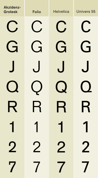
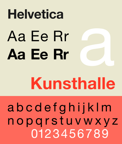
Above: subtle, fundamental nuances in type design. Helvetica’s story is a fascinating one. Below: the 1957 design from the Swiss Haas Type Foundry. (Images courtesy of Jim Hood of GearedBull).


4 Comments
Join the discussion and tell us your opinion.
This is simply outstanding. I b l e t t s h a i v n i o c m g y c h e u s h rst f h d w k..
The SwissF(r)ontRunner (written with his Random Minimal Alphabet)
Thank you FontRunner. We also like your random alphabet.
The Brandpowder Team
Dear BrandPowder Studios,
I write on behalf of the Knights of Helvetican Brotherhood. We are true supporters of your efforts to revamp *the* typeface: Helvetica–the best that ever was, and the best that ever will be. Praise the Invisible Serifs!
Thanks to you and your eco-friendly and sustainable rendition of the Great One, we now can now rule the world responsibly.
For this we commend you, fellow Helvetican.
The world should not be tainted by sub-par, mediocre and historically-binding typefaces like Comic Sans, Papyrus and Copperplate. Cartoon characters, egyptians and gothic descendants have no place in a modern society like ours.
We, the true race, are heading for the future, where neutrality in the typeface must reflect our neutrality to the things that might be, allowing us to adapt quickly without path-dependence to whatever our glorious journey into the unknown might bring.
Again, thank you, BrandPowder.
When we will unleash the true amassed power of our race, in its echoes you will be remembered.
– A Knight of the Helvetican Brotherhood.
Brave Knight of the Helvetica Brotherhood,
thanks for your genuine support. We are working hard to expand this project. New typefaces will be published soon on Brandpowder! We have been unexpectedly overwhelmed by messages from many enthusiasts, supporters like you guys, and even quick adopters of our Minimal Helvetica. We are not particularly fond of lousy fonts but we also think it’s good to give every typeface a chance. Comic Sans is great for comic strips and Copperplate is the perfect choice for tombstone’s engraving (thanks to its short serifs, you chisel the surface without chipping the marble off). And even if Brandpowder’s logo is set in Arial Black, we love Helvetica and, along with 3 billion people, we regard it as THE type par excellence.
All the Best,
The Brandpowder Team